ShopDreamUp AI ArtDreamUp
Deviation Actions
Description
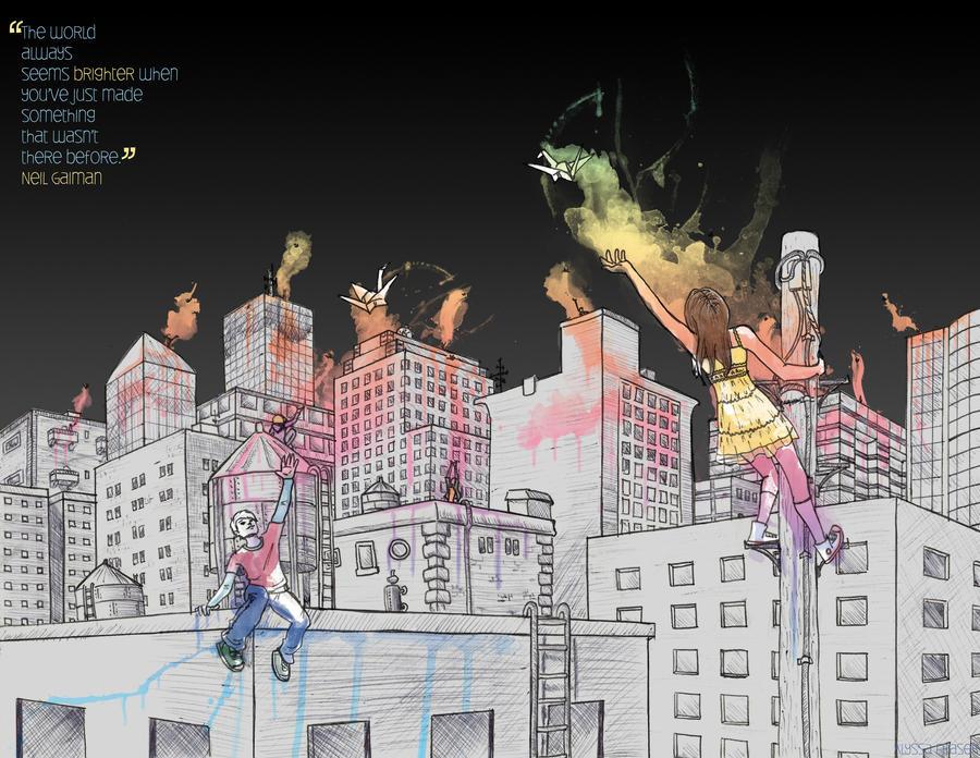
Soooo....here's the finished version. Or at least the version I handed in...which is why Il called it a WIP.  Still not completely happy with it...I think the cranes need to be higher. Bunch of other stuff too, and please feel encouraged to point out any improvements you can think of.
Took a lot of the advice you guys (and IRL people too!) gave me for this version. Added some more buildings, darkened up the sky significantly (there was WAY too much white space before), tried to make the connection between the cranes and the colours more clear (although it still needs a lot of work I'm thinking) and fixed up the poor guy's leg and face.
So yes...thanks to everybody for your input on the last version! I look forward to hearing from you guys again for this one.
-Liss
Took a lot of the advice you guys (and IRL people too!) gave me for this version. Added some more buildings, darkened up the sky significantly (there was WAY too much white space before), tried to make the connection between the cranes and the colours more clear (although it still needs a lot of work I'm thinking) and fixed up the poor guy's leg and face.
So yes...thanks to everybody for your input on the last version!
-Liss
Image size
3300x2550px 4.54 MB
© 2011 - 2024 AlyssaF
Comments12
Join the community to add your comment. Already a deviant? Log In
You know what I just realised. The fact you drew this by hand ties into the quote.  If it was all done on a computer then I guess you could still say that something's been made...but the fact it was drawn by hand makes it seem a bit more like a creation of someone's imagination.
  Maybe that's just a bias coming through.
This version definitely hits you when you see that. The change is very obvious. The expanded city and the dark sky. After all that with the buildings...you added MORE?
  The city looks great. The variety in buildings and the layout look awesome. I think the dark sky works with the colour. Makes it pop a bit more methinks. I like those touches of the colour dripping down the buildings too.
  The colour in the sky looks a bit different too. A bit more focused or something.
This version is definitely a HUGE evolution from the previous one.
This version definitely hits you when you see that. The change is very obvious. The expanded city and the dark sky.
This version is definitely a HUGE evolution from the previous one.


